Chapter 5 Concordance of variables selected by the three methods
In this chapter, we are going to use different visualisation approaches to display the variables selected by the three methods:
- UpSet plot: highlights overlap of the variables selected by the three methods.
- Selbal-like plot: lists the selected variables and displays their discriminating ability with respect to sample groups.
- plotLoadings: visualises the variable coefficients and sample groups each variable contributes to.
- Trajectory plot: represents the rank of the variables selected by coda-lasso and clr-lasso, and their corresponding regression coefficients
- GraPhlAn: displays the taxonomic tree of selected variables (HFHSday1 data only).
5.1 Crohn case study
5.1.1 UpSetR
UpSet is a visualisation technique for the quantitative analysis of sets and their intersections (Lex et al. 2014). Before we apply upset(), we take the list of variable vectors selected with the three methods and convert them into a data frame compatible with upset() using fromList(). We then assign different color shcemes for each variable selection.
Crohn.select <- list(selbal = Crohn.results_selbal$varSelect,
                     clr_lasso = Crohn.results_clrlasso$varSelect,
                     coda_lasso = Crohn.results_codalasso$varSelect)


Crohn.select.upsetR <- fromList(Crohn.select)

upset(as.data.frame(Crohn.select.upsetR), main.bar.color = 'gray36',
      sets.bar.color = color[c(1:2,5)], matrix.color = 'gray36',
      order.by = 'freq', empty.intersections = 'on',
      queries = list(list(query = intersects, params = list('selbal'),
                          color = color[5], active = T),
                     list(query = intersects, params = list('clr_lasso'),
                          color = color[2], active = T),
                     list(query = intersects, params = list('coda_lasso'),
                          color = color[1], active = T)))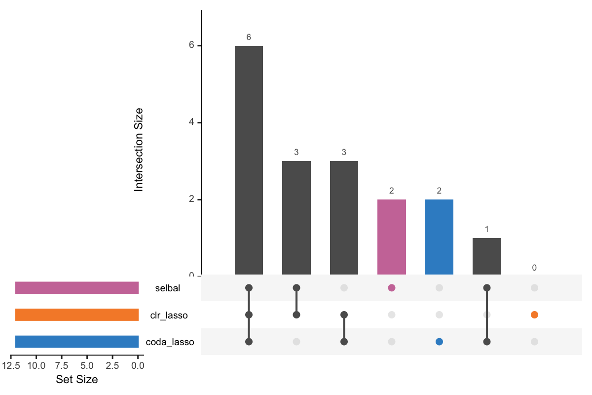
Figure 5.1: UpSet plot showing overlap between variables selected with different methods.
In Figure 5.1, the left bars show the number of variables selected by each method. The right bar plot combined with the scatterplot show different intersection and their aggregates. For example, in the first column, three points are linked with one line, and the intersection size of the bar is 6. This means that 6 variables are selected by all these three methods. While in the second column, 3 variables are only selected by the method selbal and clr-lasso.
5.1.2 Selbal-like plot
As mentioned in Chapter 2, selbal visualised the results using a mixture of selected variables, box plots and density plots:
# selbal
Crohn.selbal_pos <- Crohn.results_selbal$posVarSelect
Crohn.selbal_neg <- Crohn.results_selbal$negVarSelect
selbal_like_plot(pos.names = Crohn.selbal_pos,
                 neg.names = Crohn.selbal_neg,
                 Y = y_Crohn, selbal = TRUE,
                 FINAL.BAL = Crohn.results_selbal$finalBal)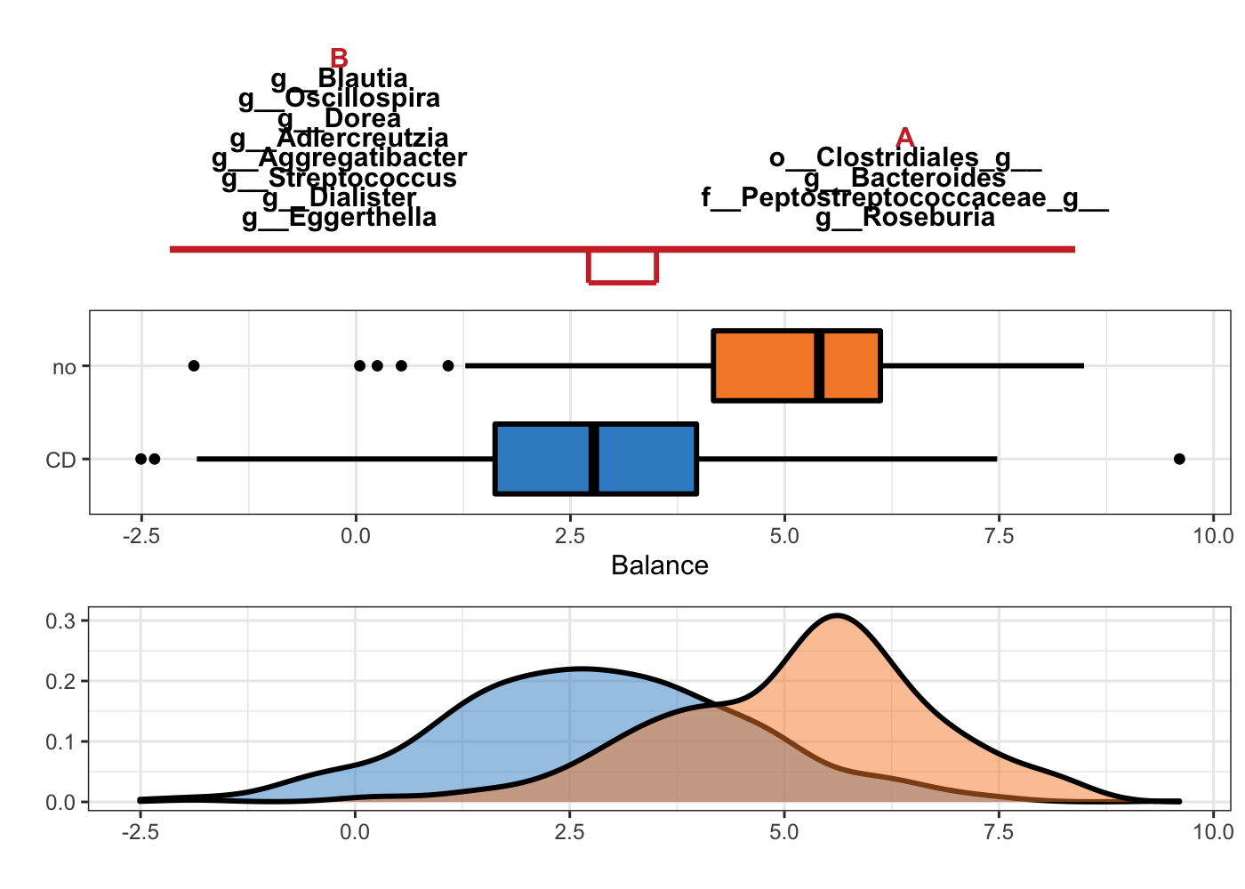
Figure 5.2: Selbal plot showing variables selected with method selbal and the ability of these variables to discriminate CD and non-CD individuals.
In Figure 5.2, the two groups of variables that form the global balance are specified at the top of the plot. They are equally important. The middle box plots represent the distribution of the balance scores for CD and non-CD individuals. The bottom part of the figure contains the density curve for each group.
Selbal-like plot is an extension of this kind of plots. Besides the visualisation of selbal, it can also be used to visualise the results from clr-lasso and coda-lasso, and generate similar plots as Figure 5.2.
# clr_lasso
Crohn.clr_pos <- Crohn.results_clrlasso$posCoefSelect
Crohn.clr_neg <- Crohn.results_clrlasso$negCoefSelect
selbal_like_plot(pos.names = names(Crohn.clr_pos),
                 neg.names = names(Crohn.clr_neg),
                 Y = y_Crohn, X = x_Crohn)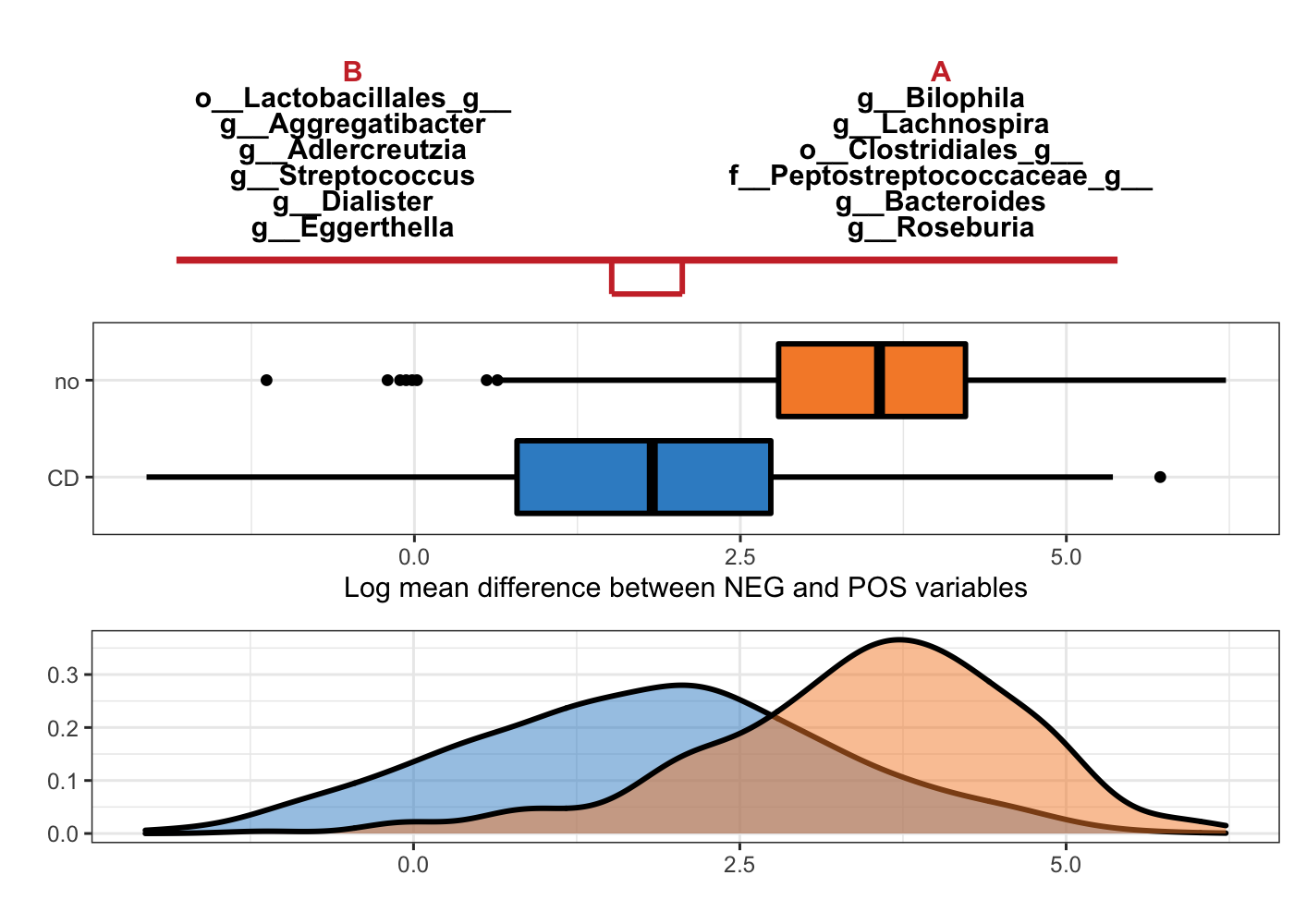
Figure 5.3: Selbal-like plot showing variables selected with method clr-lasso and the ability of these variables to discriminate CD and non-CD individuals.
In Figure 5.3, the top panel lists the selected variable names with either negative (B) or positive (A) coefficients. The names are ordered according to their importance (absolute coefficient values). The middle boxplots are based on the log mean difference between negative and positive variables: \(\frac{1}{p_{+}}\sum_{i=1}^{p_{+}}logX_{i} - \frac{1}{p_{-}}\sum_{j=1}^{p_{-}}logX_{j}\). This log mean difference is calculated for each sample as a balance score, because it is proportionally equal to the balance mentioned in (Rivera-Pinto et al. 2018). The bottom density plots represent the distributions of the log mean difference scores for CD and non-CD individuals.
# coda_lasso
Crohn.coda_pos <- Crohn.results_codalasso$posCoefSelect
Crohn.coda_neg <- Crohn.results_codalasso$negCoefSelect
selbal_like_plot(pos.names = names(Crohn.coda_pos),
                 neg.names = names(Crohn.coda_neg),
                 Y = y_Crohn, X = x_Crohn)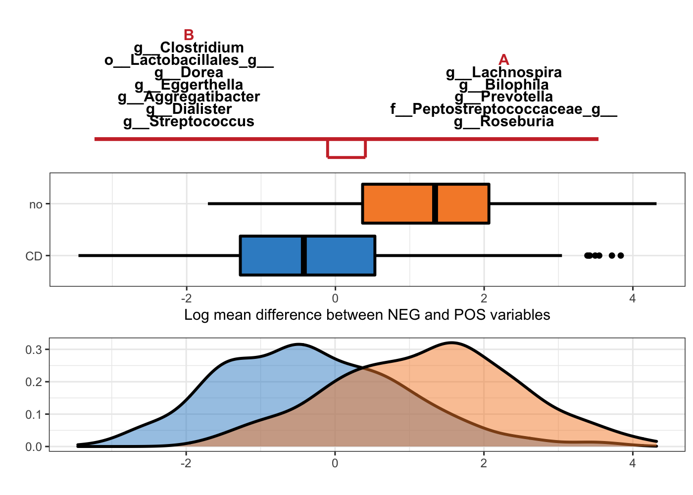
Figure 5.4: Selbal-like plot showing variables selected with method coda-lasso and the ability of these variables to discriminate CD and non-CD individuals.
The interpretation of Figure 5.4 is the same as Figure 5.3, but with variables selected with method coda-lasso.
5.1.3 plotLoadings
An easy way to visualise the coefficients of the selected variables is to plot them in a barplot in mixMC (Rohart et al. 2017). We have amended the plotLoadings() function from the package mixOmics to do so. The argument Y specified the sample class, so that the color assigened to each variable represents the class that has the larger mean value (method = ‘mean’ and contrib.method = ‘max’).
# clr_lasso
Crohn.clr_coef <- Crohn.results_clrlasso$coefficientsSelect
Crohn.clr_data <- x_Crohn[ ,Crohn.results_clrlasso$varSelect]
Crohn.clr.plotloadings <- plotcoefficients(coef = Crohn.clr_coef,
                                  data = Crohn.clr_data,
                                  Y = y_Crohn,
                                  method = 'mean',
                                  contrib.method = 'max',
                                  title = 'Coefficients of clr-lasso on Crohn data')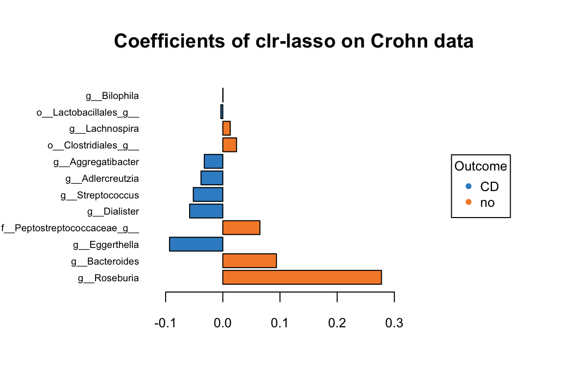
Figure 5.5: The plotLoadings of selected variables with clr-lasso.
Figure 5.5 shows that the variables colored in orange have an abundance greater in non-CD samples relative to CD samples (e.g. Roseburia), while the blue ones have a greater abundance in CD samples relative to non-CD samples (e.g. Eggerthella). It is based on their mean per group (CD vs. non-CDs). The bar indicates the coefficient. As we can see, all selected variables with a greater abundance in non-CD samples have been assigned a positive coefficient, and variables with a greater abundance in CD samples have been assigned a negative coefficient.
# coda_lasso
Crohn.coda_coef <- Crohn.results_codalasso$coefficientsSelect
Crohn.coda_data <- x_Crohn[ ,Crohn.results_codalasso$varSelect]

Crohn.coda.plotloadings <- plotcoefficients(coef = Crohn.coda_coef,
                                data = Crohn.coda_data,
                                Y = y_Crohn,
                                method = 'mean',
                                contrib.method = 'max',
                                title = 'Coefficients of coda-lasso on Crohn data')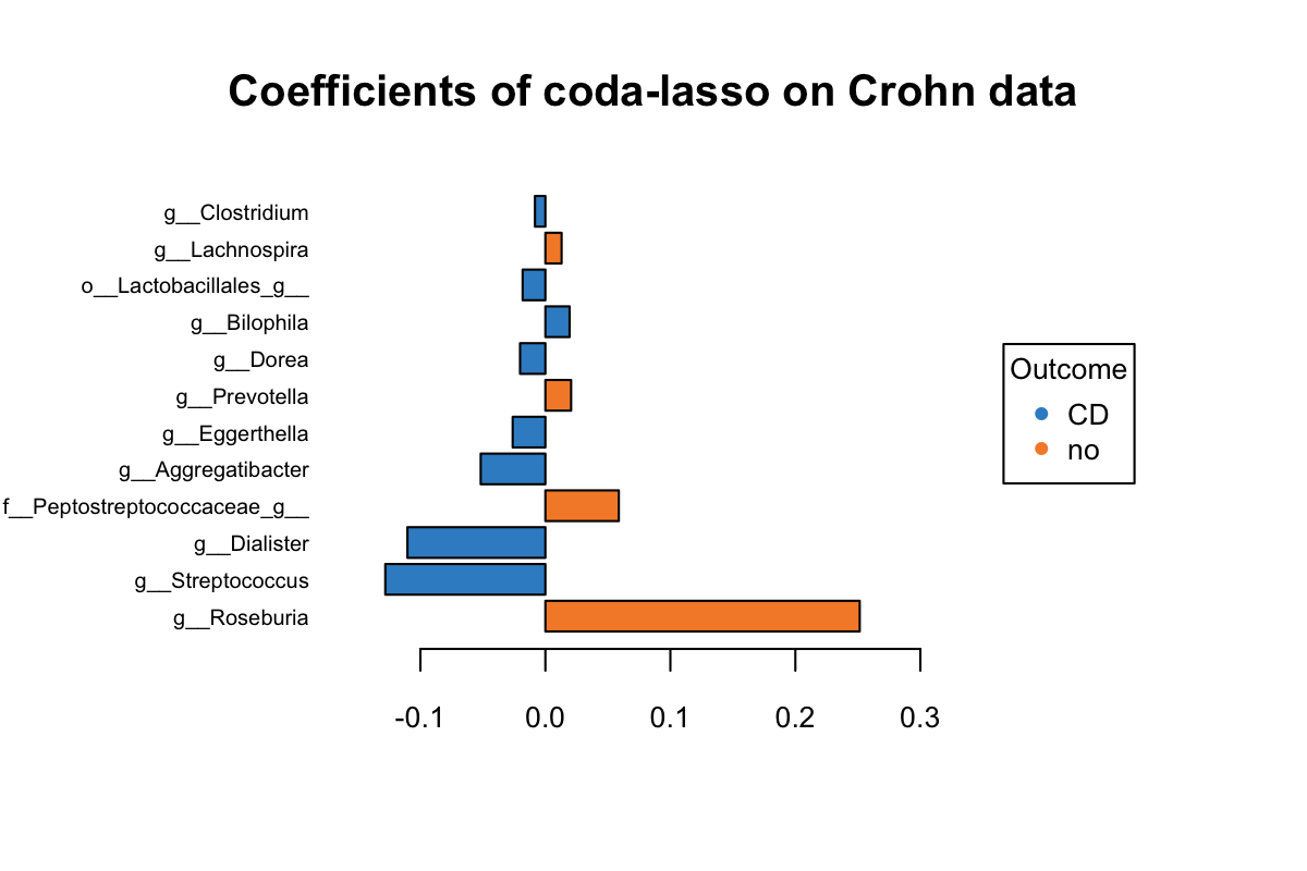
Figure 5.6: The plotLoadings of selected variables with coda-lasso.
The same as Figure 5.5, we can interpret Figure 5.6 as follows. Both Roseburia and Peptostreptococcaceae selected by clr-lasso and coda-lasso have a greater abundance in non-CD group and were assigned with the same coeffcient rank. But both Eggerthella and Dialister selected by two methods were assigned with very different coefficient rank. Several variables have a greater abundance in CD group, but with a positive coefficient. It means this model is not optimal at some extent. This may suggest that clr-lasso is better at identifying discriminative variables than coda-lasso.
5.1.4 Trajectory plots
To visualise the change of variable coefficients and their ranks in the selection between different methods, we use trajectory plots.
TRAJ_plot(selectVar_coef_method1 = Crohn.coda_coef,
          selectVar_coef_method2 = Crohn.clr_coef,
          selectMethods = c('coda-lasso', 'clr-lasso'))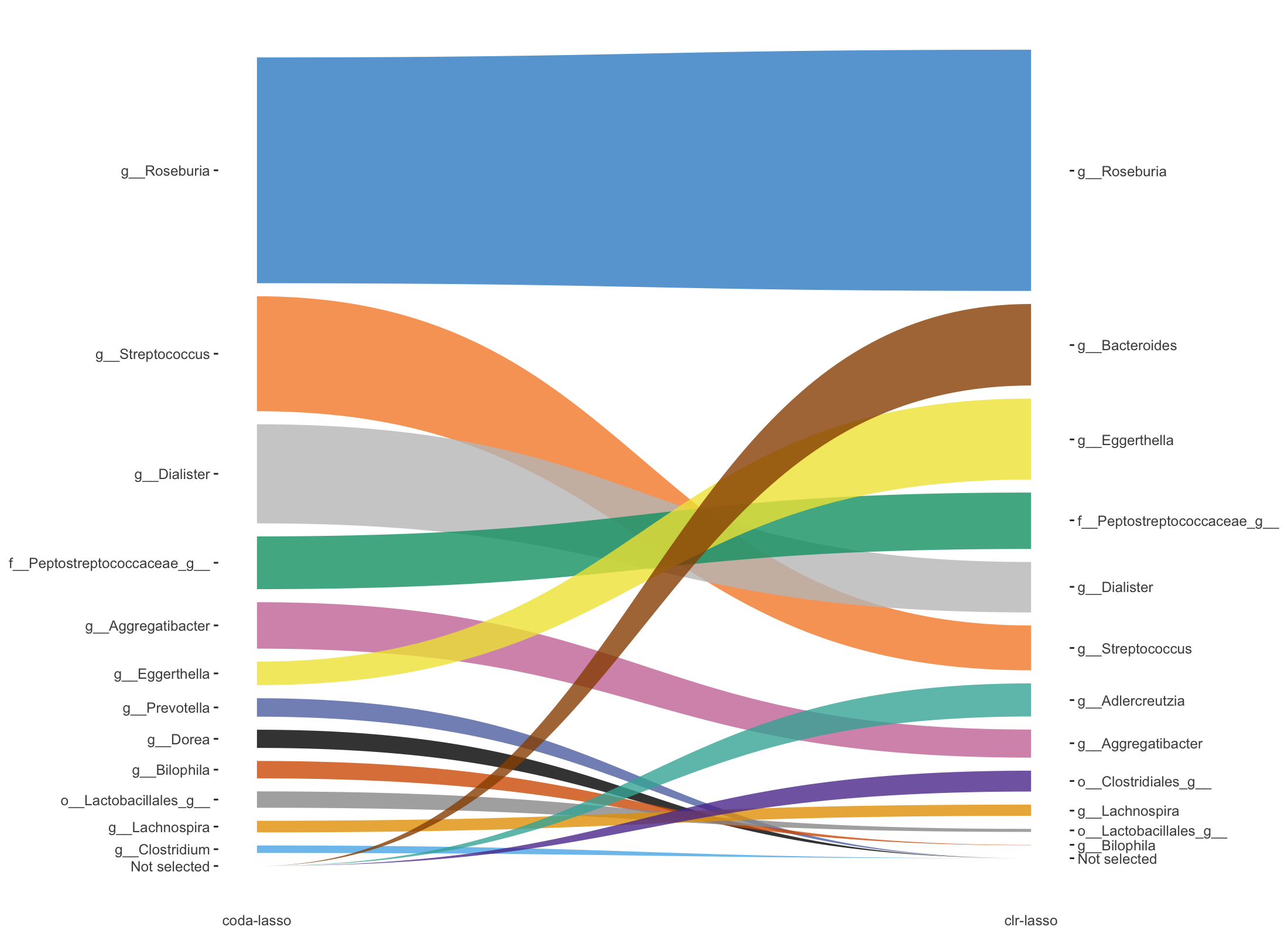
Figure 5.7: Trajectory plots of selected variables from both coda-lasso and clr-lasso in Crohn data.
Figure 5.7 shows the selected variables ordered by their rank in the selection (according to their coefficient absolute values) between coda-lasso and clr-lasso, with the thickness of the lines representing the coefficient absolute values.
In this plot 5.7, we can visualise the rank change of each selected variable between coda-lasso and clr-lasso selection. For example, the rank of Dialister is lower in clr-lasso compared to coda-lasso. Moreover, we can detect the variables (e.g. Bacteroides) that are selected by one method (e.g. clr-lasso) with high coefficient rank, but not selected by the other method (e.g. coda-lasso).
5.2 HFHS-Day1 case study
Guidance on how to interpret the following plots is detailed in previous section: Crohn case study.
5.2.1 UpSetR
HFHS.select <- list(selbal = HFHS.results_selbal$varSelect,
                    clr_lasso = HFHS.results_clrlasso$varSelect,
                    coda_lasso = HFHS.results_codalasso$varSelect)

HFHS.select.upsetR <- fromList(HFHS.select)

upset(as.data.frame(HFHS.select.upsetR), main.bar.color = 'gray36',
      sets.bar.color = color[c(1,2,5)], matrix.color = 'gray36',
      order.by = 'freq', empty.intersections = 'on',
      queries = list(list(query = intersects, params = list('selbal'),
                          color = color[5], active = T),
                     list(query = intersects, params = list('coda_lasso'),
                          color = color[2], active = T),
                     list(query = intersects, params = list('clr_lasso'),
                          color = color[1], active = T)))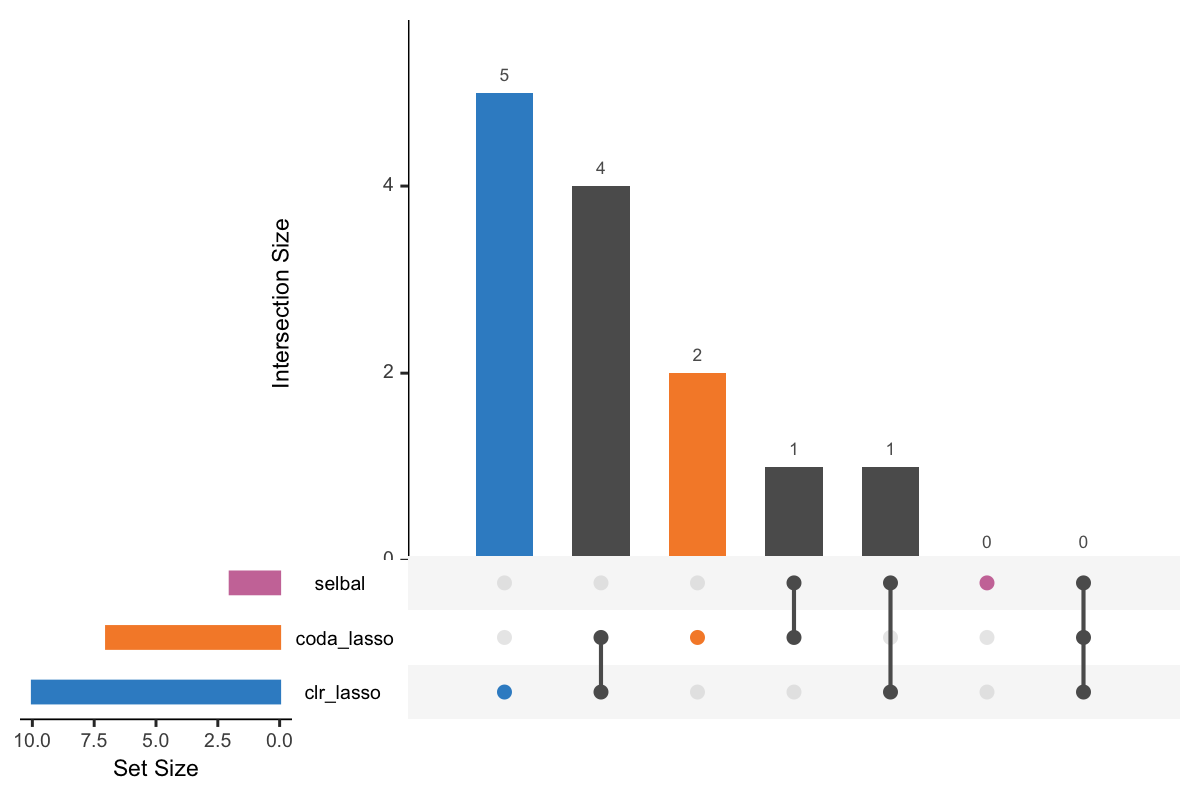
Figure 5.8: UpSet plot showing overlap between variables selected with different methods.
Figure 5.8 shows that 5 OTUs are only selected with clr-lasso, 4 OTUs are selected both with coda-lasso and clr-lasso, 2 OTUs are only selected with coda-lasso, 1 OTUs is selected with both selbal and coda-lasso, and 1 is selected both with selbal and clr-lasso. Among three methods, clr-lasso selected the largest number of OTUs and selbal the smallest.
5.2.2 Selbal-like plot
# selbal
HFHS.selbal_pos <- HFHS.results_selbal$posVarSelect
HFHS.selbal_neg <- HFHS.results_selbal$negVarSelect
selbal_like_plot(pos.names = HFHS.selbal_pos,
                 neg.names = HFHS.selbal_neg,
                 Y = y_HFHSday1, selbal = TRUE,
                 FINAL.BAL = HFHS.results_selbal$finalBal,
                 OTU = T, taxa = taxonomy_HFHS)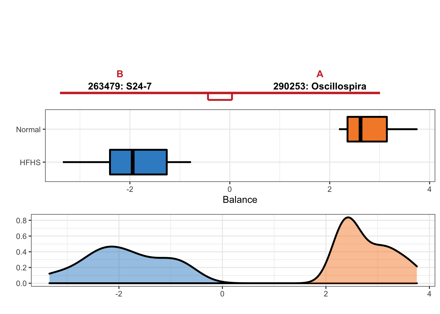
Figure 5.9: Selbal plot showing variables selected with methd selbal and the ability of these variables to discriminate HFHS and normal individuals.
# clr_lasso
HFHS.clr_pos <- HFHS.results_clrlasso$posCoefSelect
HFHS.clr_neg <- HFHS.results_clrlasso$negCoefSelect
selbal_like_plot(pos.names = names(HFHS.clr_pos),
                 neg.names = names(HFHS.clr_neg),
                 Y = y_HFHSday1, X = x_HFHSday1, OTU = T,
                 taxa = taxonomy_HFHS)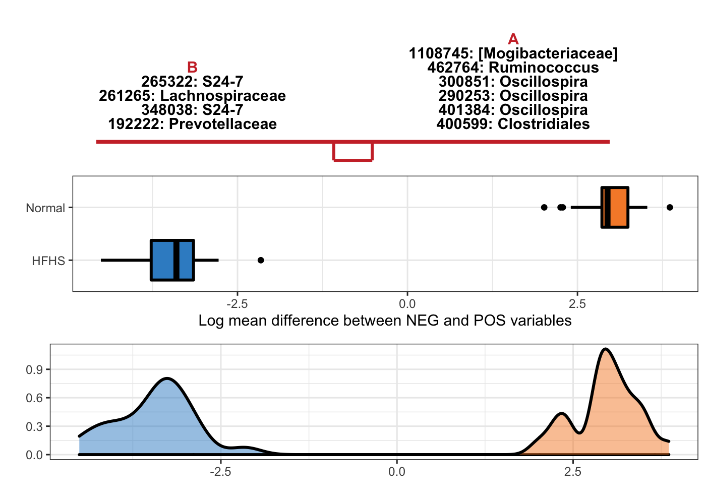
Figure 5.10: Selbal-like plot showing variables selected with method clr-lasso and the ability of these variables to discriminate HFHS and normal individuals.
# coda_lasso
HFHS.coda_pos <- HFHS.results_codalasso$posCoefSelect
HFHS.coda_neg <- HFHS.results_codalasso$negCoefSelect
selbal_like_plot(pos.names = names(HFHS.coda_pos),
                 neg.names = names(HFHS.coda_neg),
                 Y = y_HFHSday1, X = x_HFHSday1,
                 OTU = T, taxa = taxonomy_HFHS)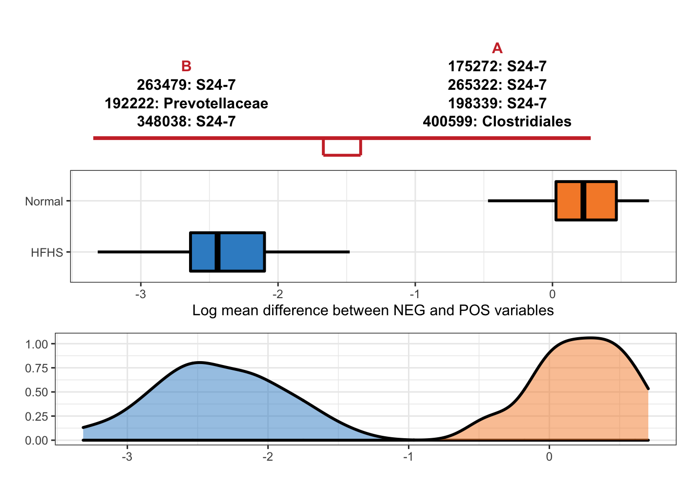
Figure 5.11: Selbal-like plot showing variables selected with method coda-lasso and the ability of these variables to discriminate HFHS and normal individuals.
Note: S24-7 is a family from order Bacteroidales.
Among these methods, selbal only needs two OTUs to build a balance, it also means the association between microbiome composition and diet is very strong.
5.2.3 plotLoadings
# clr_lasso
HFHS.clr_coef <- HFHS.results_clrlasso$coefficientsSelect
HFHS.clr_data <- x_HFHSday1[ ,HFHS.results_clrlasso$varSelect]
HFHS.clr.plotloadings <- plotcoefficients(coef = HFHS.clr_coef,
                              data = HFHS.clr_data,
                              Y = y_HFHSday1,
                              title = 'Coefficients of clr-lasso on HFHSday1 data',
                              method = 'mean',
                              contrib.method = 'max',
                              OTU = T,
                              taxa = taxonomy_HFHS)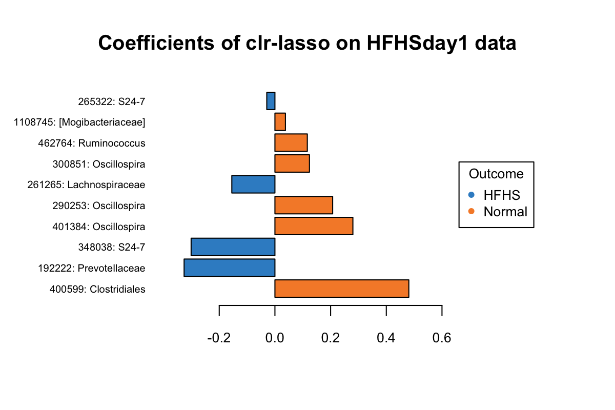
Figure 5.12: The plotLoadings of selected variables with clr-lasso.
# coda_lasso
HFHS.coda_coef <- HFHS.results_codalasso$coefficientsSelect
HFHS.coda_data <- x_HFHSday1[ ,HFHS.results_codalasso$varSelect]

HFHS.coda.plotloadings <- plotcoefficients(coef = HFHS.coda_coef,
                            data = HFHS.coda_data,
                            Y = y_HFHSday1,
                            method = 'mean',
                            contrib.method = 'max',
                            title = 'Coefficients of coda-lasso on HFHSday1 data',
                            OTU = T,
                            taxa = taxonomy_HFHS)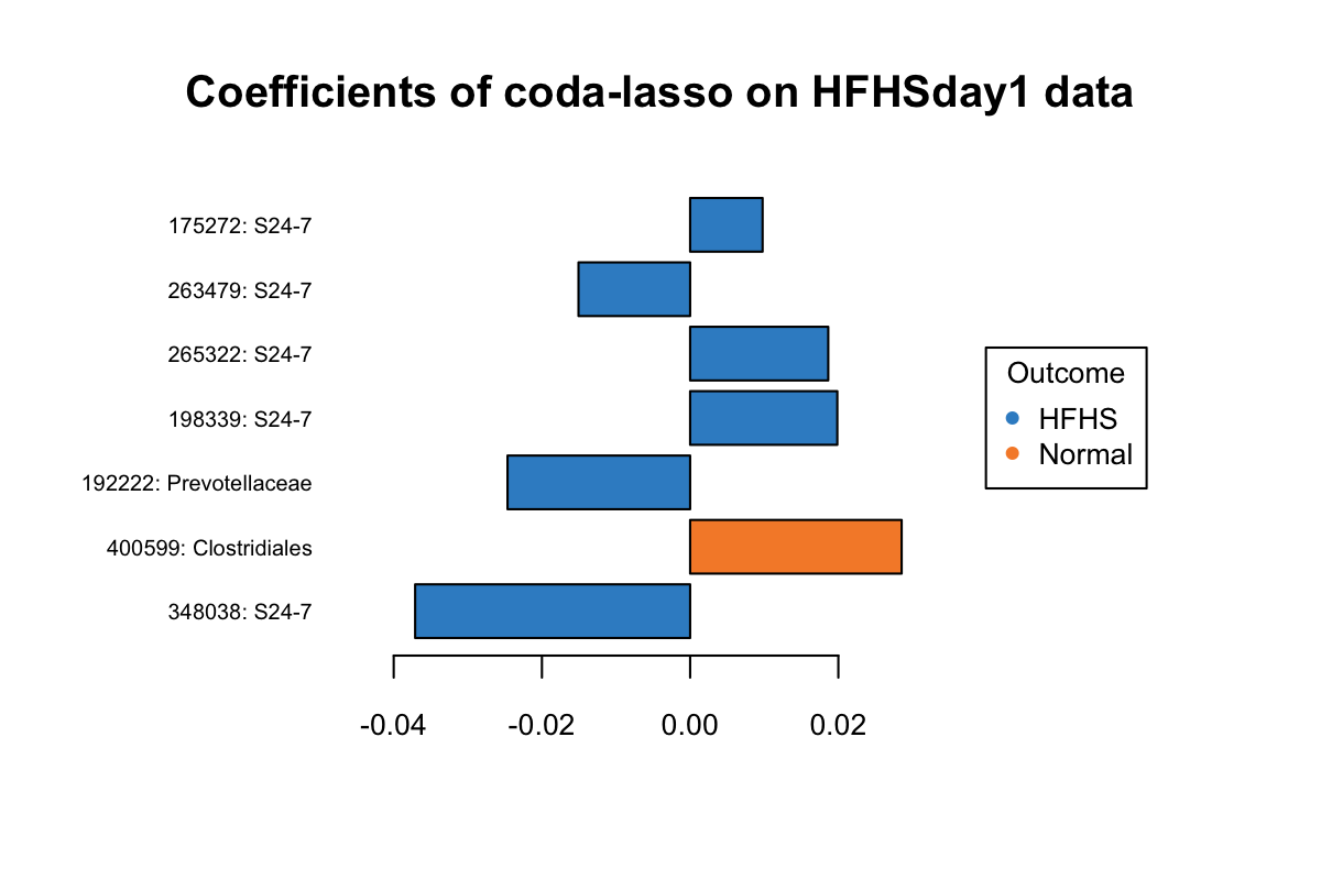
Figure 5.13: The plotLoadings of selected variables with coda-lasso.
In Figure 5.13, three OTUs 175272: S24-7, 265322: S24-7, 198339: S24-7 have a greater abundance in HFHS group but were assigned with positive coefficients.
5.2.4 Trajectory plots
TRAJ_plot(selectVar_coef_method1 = HFHS.coda_coef,
          selectVar_coef_method2 = HFHS.clr_coef,
          selectMethods = c('coda-lasso', 'clr-lasso'),
          OTU = T, taxa = taxonomy_HFHS)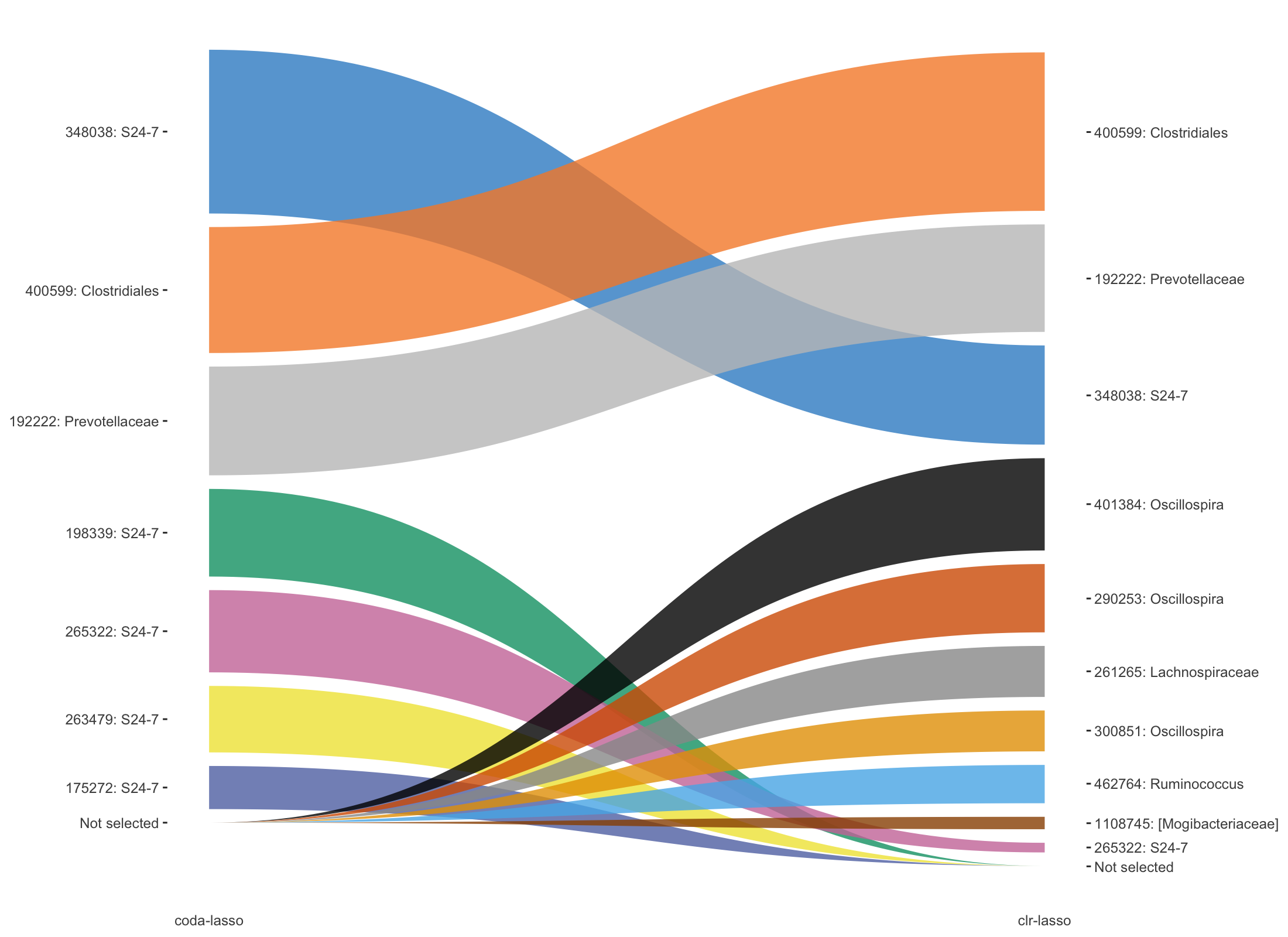
Figure 5.14: Trajectory plots of selected variables with both coda-lasso and clr-lasso in HFHSday1 data.
In Figure 5.14, top three OTUs selected with clr-lasso are also selected as top OTUs from coda-lasso but with different order. The other OTUs are either selected by coda-lasso or clr-lasso.
5.2.5 GraPhlAn
As we also have the taxonomic information of HFHSday1 data, we use GraPhlAn to visualise the taxonomic information of the selected OTUs. GraPhlAn is a software tool for producing high-quality circular representations of taxonomic and phylogenetic trees (https://huttenhower.sph.harvard.edu/graphlan). It is coded in Python.
We first remove empty taxa (e.g. species) and aggregate all these selected variables into a list. Then we use function graphlan_annot_generation() to generate the input files that graphlan python codes require. In the save_folder, there are two existing files: annot_0.txt and graphlan_all.sh. After we generate our input files taxa.txt and annot_all.txt, we only need to run the ./graphlan_all.sh in the bash command line to generate the plot.
# remove empty columns
HFHS.tax_codalasso <- HFHS.tax_codalasso[,-7]
HFHS.tax_clrlasso <- HFHS.tax_clrlasso[,-7]
HFHS.tax_selbal <- HFHS.tax_selbal[,-7]

HFHS.select.tax <- list(selbal = HFHS.tax_selbal,
                        clr_lasso = HFHS.tax_clrlasso,
                        coda_lasso = HFHS.tax_codalasso)

graphlan_annot_generation(taxa_list = HFHS.select.tax, save_folder = 'graphlan/')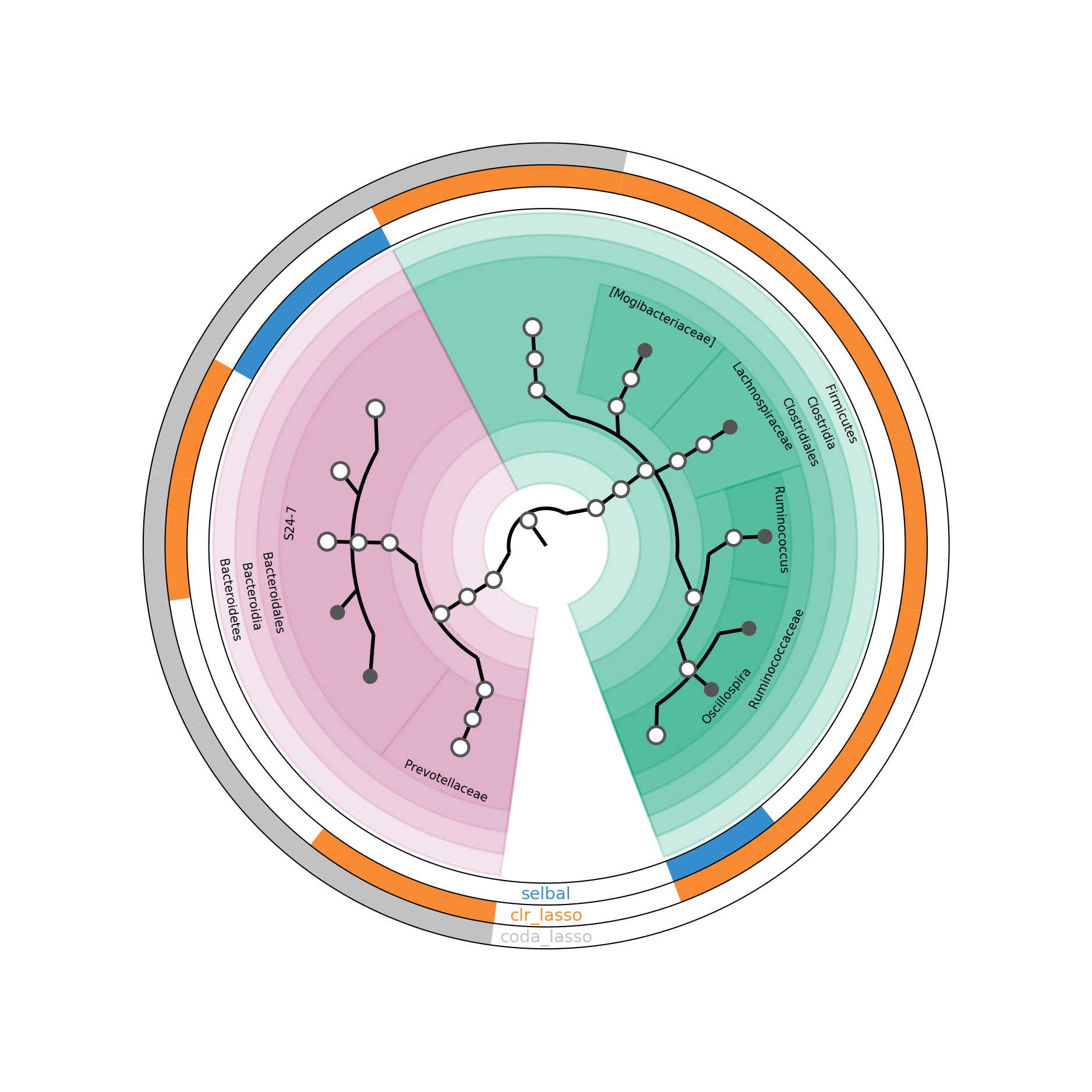
Figure 5.15: GraPhlAn of selected taxa from different methods in HFHSday1 data.
In Figure 5.15, the inner circle is a taxonomic tree of selected OTUs. The outside circles indicate different selection methods. If a proportion of a circle is coloured, it means that the corresponding OTU is selected by the method labeled on the circle. If the bottom nodes are coloured in gray, it indicates the OTUs are only selected by one method.
References
Lex, Alexander, Nils Gehlenborg, Hendrik Strobelt, Romain Vuillemot, and Hanspeter Pfister. 2014. “UpSet: Visualization of Intersecting Sets.” IEEE Transactions on Visualization and Computer Graphics 20 (12). IEEE: 1983–92.
Rivera-Pinto, J, JJ Egozcue, Vera Pawlowsky-Glahn, Raul Paredes, Marc Noguera-Julian, and ML Calle. 2018. “Balances: A New Perspective for Microbiome Analysis.” MSystems 3 (4). Am Soc Microbiol: e00053–18.
Rohart, Florian, Aida Eslami, Nicholas Matigian, Stephanie Bougeard, and Kim-Anh Le Cao. 2017. “MINT: A Multivariate Integrative Method to Identify Reproducible Molecular Signatures Across Independent Experiments and Platforms.” BMC Bioinformatics 18 (1). BioMed Central: 128.